Summary
Optimizing your B2B SaaS self-service checkout is paramount for both maximizing conversions and achieving revenue goals. Just like e-commerce, B2B buyers expect a fast, easy, and effortless purchasing experience that mirrors their consumer interactions. This requires a careful balance between minimizing friction to boost sign-ups and strategically encouraging upgrades, longer commitments, and comprehensive data collection for recurring payments. Mastering this balance is key to sustainable growth and customer satisfaction.
Key Takeaways
- Successfully optimizing SaaS self-service checkout requires balancing high conversion rates with maximizing cash flow and recurring revenue.
- Prioritize user experience by significantly reducing clicks, keystrokes, and the number of data fields to combat form fatigue and prevent cart abandonment.
- Leverage strategic elements like social sign-on, auto-populating forms, digital wallets, and deferred data collection to streamline the checkout process.
- Build customer confidence by prominently displaying online reviews, testimonials, and trust badges throughout the checkout flow.
- Continuously test critical elements such as screen count, form fields, button designs, and payment options to identify what drives the best conversion rates, and ensure a seamless mobile experience across all devices and browsers.
Boost Free-to-Paid Conversion Rates
Optimize Self-Service Checkout for SaaS
E-commerce companies invest significant time and energy in optimizing their checkout process to maximize conversions and minimize cart abandonments. B2B SaaS providers should adopt the same mindset. Every B2B buyer is also a B2C buyer, and each person brings their consumer experience and expectations with them to work. B2B buyers also want a checkout experience that is fast, easy, and almost effortless. SaaS companies share some common goals with customers. They also want the checkout process to be easy and fast to maximize the number of customers that sign up. However, SaaS providers also want to maximize their revenues. They want to take the opportunity to encourage customers to purchase more expensive offerings and to make longer-term commitments. SaaS companies also may want to collect additional information to ensure that they can collect recurring payments throughout the lifecycle of the relationship. In designing a self-service checkout experience for SaaS, companies want to maximize:
- Conversion rates – Maximizing the number of upgrades from free trials to paid plan
- Cash flow – Maximizing the number of prepay upfront annual plans (versus monthly billing)
- Recurring revenue – Maximizing ARR and the number of customers selecting premium offerings and add-ons
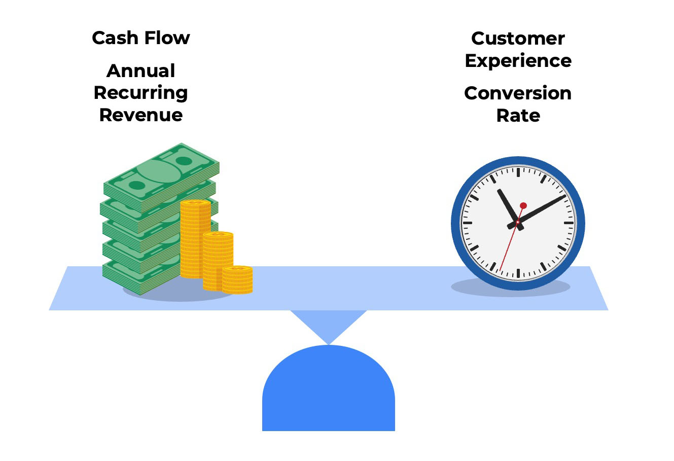
All three goals must be balanced to arrive at the optimal model. There is no one “right way” to do it. Some SaaS companies optimize for minimal friction. Their checkout process has just two screens and collects only 6 to 8 data points. Others optimize for upsells and cross-sells. These checkout processes are more sophisticated, with three to four screens and 10 to 15 customer data attributes collected.
Four Phases of Self-Service Checkout for SaaS
The self-checkout process can be divided into four phases:
- Plan Selection – Selects the tier (e.g., good, better, best), billing frequency, and subscription length
- Shopping Cart – Reviews items, sales taxes, and totals. Makes adjustments to unit quantities.
- Payment Method – Provides details needed to pay via credit card, digital wallet, or bank transfer.
- Final Checkout – Opts in to recurring billing and general terms. Clicks to make initial payment.
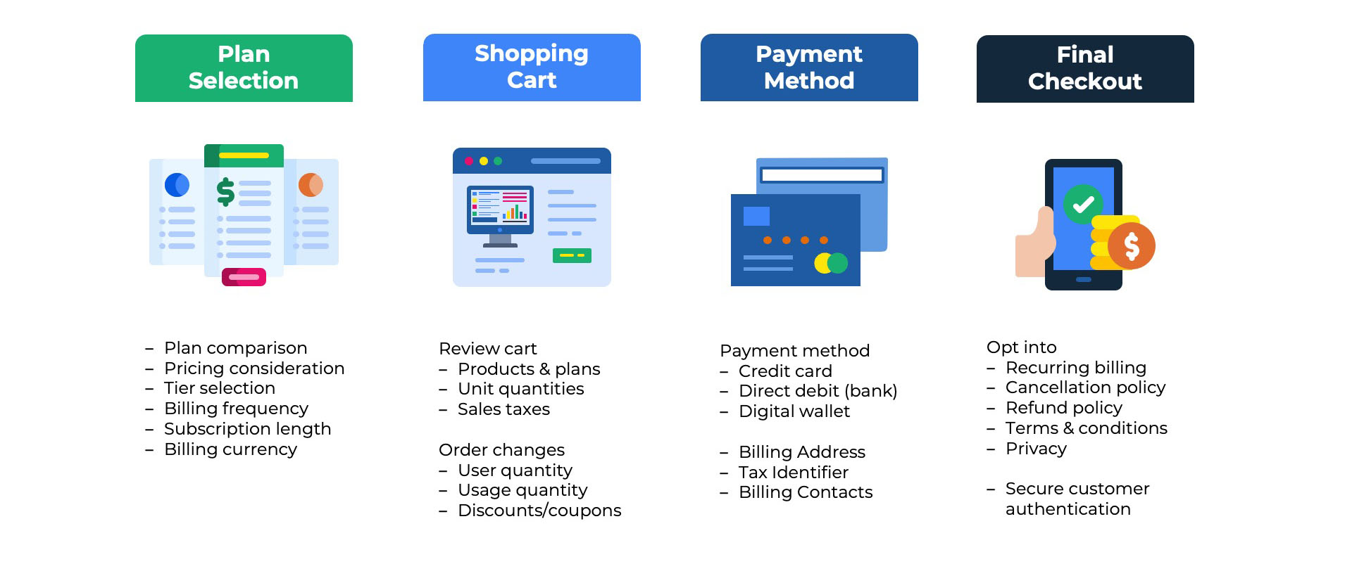
Each SaaS company approaches the checkout design differently. Sometimes, there is a one-to-one mapping between the phases above and the screens the user views. In other cases, two or more phases are combined into a single screen. In more extended checkouts, a single phase may be spread across multiple screens.
UX Best Practices to Boost Conversion Rates
Be mindful of the number of clicks and keystrokes a user must perform during checkout. Reduce the number of data fields collected to avoid form fatigue. Eliminate unnecessary steps. Try consolidating the number of pages in the checkout flow from three or four to two or just one. Reduce clutter on the pages. Most checkout pages do not have a menu or navigation at the top of the screen. There should not be any stock photography or illustrations to distract the user from the primary focus of capturing the data needed for checkout.
Avoid the need for the customer to go backward in the checkout flow, which increases the likelihood of cart abandonment. Design in a way that keeps the customer on the current page or advancing to the next. Repeat the shopping cart’s critical details about selected plans, unit quantities, billing frequency, and subscription length. Allow options for users to edit the shopping cart on the same page rather than requiring them to click the back button on the browser. Adding simple plus/minus buttons, toggles, and drop-down menus into the cart keeps the presentation clean but offers users the flexibility to change their minds.
Five Strategies to Optimize Self-Service Checkout for SaaS
- Social Sign-On – Allow the customer to use a social sign-on with Google or Microsoft rather than requiring them to create an account and verify their email address.
- Auto-Populate Forms -Automatically populate form fields such as first name, last name, and company name if you have collected that information in the free trial or freemium registration.
- Defer Data Collection – If possible, postpone the collection of optional fields such as job title, secondary billing contacts, and backup payment options until later in the customer lifecycle.
- Seamless Upsells – Design upsell and cross-sell campaigns as optional activities rather than requiring users to navigate through additional screens promoting other products.
- Digital Wallets – Allow customers to pay with stored credentials in digital wallets such as Apple Pay, Google Pay, PayPal, or Link rather than making them type in 16-digit card numbers and expiration dates.
- Bank Connections – For direct debit payments, consider a real-time account connection to the financial institution rather than making the customer research routing numbers, BICs, and SWIFT codes.
Online Reviews and Customer Testimonials
It is crucial to continue building confidence in the customer’s decision as they progress through the checkout experience. Just because they entered the checkout process does not mean they will complete it.
A popular strategy among SaaS companies is presenting customer reviews and testimonials at various points during checkout. Ideally, the testimonial is from a senior executive from a well-established brand. a photo to show that it is a real person, a short one-sentence quotation, and the company’s logo.
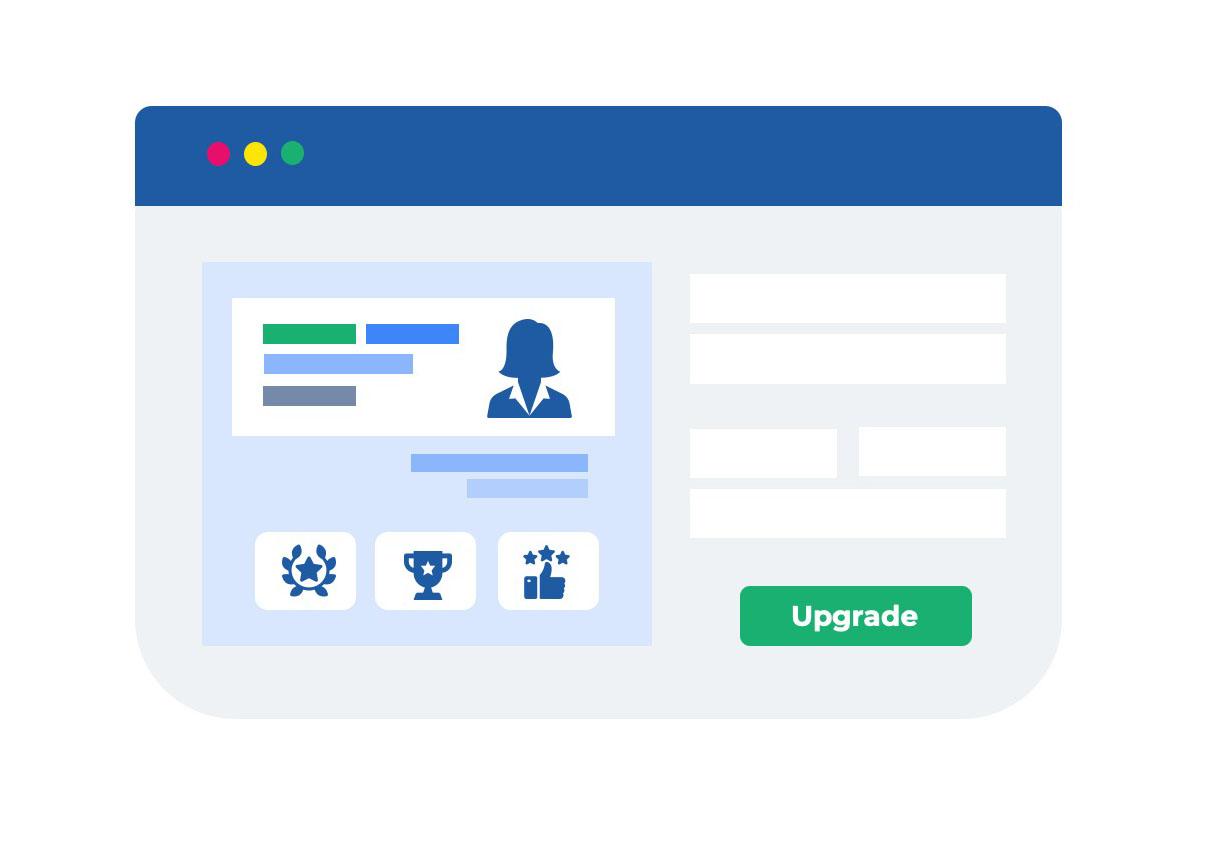
An alternative strategy is to use social proof in the form of real-world reviews from Capterra, G2, or TrustRadius. Another approach is to display a row of badges from these review sites that reinforce the quality of customer support, the ease of use, or the competitiveness of the pricing. The reviews and testimonials are usually presented in the white space to the left or right of the shopping cart or the credit card entry form.
Trust Badges
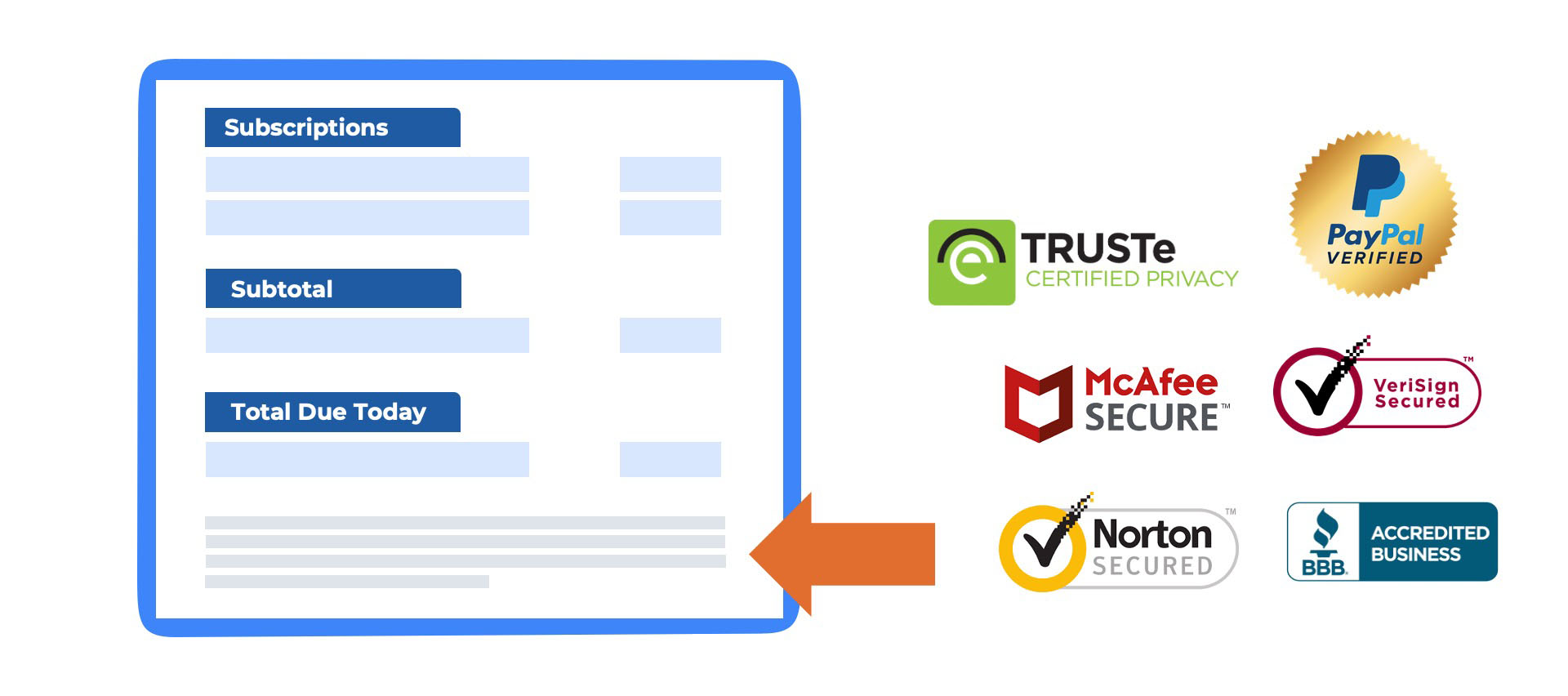
Consider adding trust badges to your checkout page to boost confidence with your users. Although e-commerce is over 30 years old, purchasing software online is still a relatively new phenomenon for most buyers. Most software purchases still occur through the traditional sales-led process in which the customer is invoiced after the contract is signed. Buyers might be apprehensive about sharing credit card numbers or bank account details with software companies they have not previously had a relationship with. Some popular trust badges include those from McAfee, Verisign, PayPal, TRUSTe, and the Better Business Bureau (BBB).
A/B Testing Self-Service Checkout for SaaS
- Number of Screens – How does the conversion rate change if you use three screens for the checkout flow versus just two or one?
- Number of Form Fields—Does reducing the number of data fields users must fill out for payment details improve conversion rates?
- Button Colors – How do users react to changes on the “call to action” buttons? Does a red checkout button get more clicks than a blue one?
- Call to Action Phrases – What changes do you observe if you use different words on the checkout page: “Subscribe” versus “Pay” versus “Upgrade”?
- Payment Methods – Does offering digital wallets such as Apple Pay and Google Pay more prominently on the page than Visa and Mastercard improve checkout volume?
- Reviews and Testimonials – Does putting more G2 badges result in a higher lift than using a customer testimonial and photo from a well-known brand?
Mobile Optimization
Ask the marketing or product team to report the percentage of your website visitors using mobile devices. If the percentage is meaningful, optimizing the checkout for mobile is important. Confirm that your checkout experience works on the latest two or three versions of Android and iOS. Test different browser to operating system combinations. Does checkout work for a MacOS user on a Safari browser? Does it work for an Android user on a Samsung Galaxy device? You can use tools like Google Analytics to understand the devices, operating systems, and browsers your end-users are actually working on to prioritize the combinations to test.
The checkout pages should use a responsive design that scales up and down automatically with the dimensions of the user’s screen. This ensures that if the customer is on a tablet, smartphone, or desktop, the experience is sized correctly for their device. However, even with a responsive design, you must be thoughtful about page design. Consider what appears “above the fold” on the screen without users having to scroll. You can use accordions and drop-down menus to enable users to shrink or expand the level of details. These design elements give you more high-level information on a single screen but empower the user to view additional details if desired.
Test the checkout flow as if you were an end-user. Ensure that fine-print text with a smaller point size is legible to users. Ensure buttons are large enough to be easily tapped on. Ensure that pop-up displays don’t cover the whole screen and are easy to close. Google offers a mobile friendliness test highlighting issues with the page design on different devices. Performance is also critical on mobile devices. Users expect a faster page load speed on mobile devices than desktops even though their phones may be on a 5G connection and the laptop is on WiFi. Google and other sites offer performance testing tools that measure page load speeds and offer helpful suggestions on accelerating. Most checkout experiences are hosted on the billing vendor’s platform, which may restrict the enhancements that you can make.
Conclusion
Ultimately, a high-converting self-service checkout for SaaS demands a delicate balance between a frictionless user experience and strategic revenue maximization. By continuously optimizing the user interface, implementing smart payment solutions, building trust through social proof, and rigorously A/B testing, companies can transform their checkout process into a powerful engine for sustainable growth. Prioritizing the customer’s ease while aligning with business objectives is the definitive path to success.
Frequently Asked Questions
What is self-service checkout for SaaS?
Self-service checkout for SaaS refers to a system that allows customers to independently sign up, subscribe to services, manage their subscriptions, and make payments without direct intervention from a sales team or support staff. It empowers users to control their entire customer journey from discovery to renewal.
What are the primary benefits of implementing a self-service checkout for SaaS businesses?
Implementing self-service checkout offers several benefits, including increased operational efficiency, reduced sales and support overhead, faster customer acquisition, improved customer experience through instant gratification, enhanced scalability, and strong support for product-led growth strategies.
How does self-service checkout handle complex pricing models like usage-based billing or mid-cycle upgrades?
Modern self-service checkout platforms are designed to accommodate complex pricing models, including tiered, per-user, and usage-based billing. They can automate prorated charges for mid-cycle upgrades or downgrades, ensuring accurate billing and a seamless experience for customers managing their subscriptions.
Is self-service checkout suitable for all B2B SaaS companies, including those with complex sales processes?
While ideal for product-led growth SaaS companies with straightforward offerings, self-service checkout can also complement B2B SaaS with complex sales processes. It can handle entry-level products or allow customers to manage add-ons, while sales teams focus on higher-value enterprise deals. The key is finding the right balance between self-service and human-assisted sales.
What are key considerations for setting up an effective self-service portal and checkout experience?
Key considerations include offering clear and transparent pricing, ensuring a user-friendly interface, providing secure and diverse payment options, enabling easy account and subscription management, offering access to billing history, and integrating with support resources to assist customers who may need help.
How can self-service checkout integrate with existing CRM or ERP systems like Salesforce?
Robust self-service checkout solutions offer APIs and often pre-built connectors to integrate seamlessly with CRM systems like Salesforce, ERPs, and accounting software. This ensures that customer data, subscription details, and payment information are synchronized across all platforms, providing a unified view of the customer and automating workflows.
You May Also Like
 Free Trial vs Freemium: Which Model Wins for SaaS Customer Acquisition?
Free Trial vs Freemium: Which Model Wins for SaaS Customer Acquisition?
 14 Days vs. 30 Days: Which SaaS Free Trial Length Drives More Conversions?
14 Days vs. 30 Days: Which SaaS Free Trial Length Drives More Conversions?
 Freemium to Paid: How to Get B2B SaaS Users to Upgrade


