
Summary
Self-service checkout is the most critical stage in product-led growth, directly impacting new customer acquisition. An optimized checkout balances customer desires for low friction and flexibility with a SaaS provider’s need to maximize bookings and collect essential data. Designing this process effectively involves understanding these differing goals and carefully selecting data points to collect. This guide explores various strategies and real-world examples to help you perfect your PLG self-service checkout.
Key Takeaways
- The checkout process is the most crucial step for new customer acquisition in product-led growth, directly affecting growth targets.
- Optimizing self-service checkout requires balancing customer demand for low friction and flexibility with the SaaS provider’s goal to maximize bookings and data collection.
- A minimum of five critical data points are essential for every self-service checkout: plan, billing frequency, subscription length, payment method, and recurring billing opt-in.
- Checkout designs vary significantly, from minimalist approaches (like Asana) to those prioritizing fraud prevention (Monday.com) or upsell/cross-sell opportunities (Figma, Zapier).
- Companies can implement opt-out free trial models (Canva, Hootsuite) where payment details are collected upfront, requiring clear communication about billing dates.
- Effective PLG self-service checkouts minimize friction, provide clear pricing, and build trust through transparent policies and secure payment options.
Self-Service Checkout for Product-Led Growth
The Most Important Part of New Customer Acquisition
The most important part of the new customer acquisition process for a product-led growth motion is the final step – the checkout. It doesn’t matter if the rest of the process is 100% optimized. If the checkout experience is ineffective, the company will struggle to meet its growth targets.
Designing an optimized self-service checkout process is challenging because the customer and the SaaS provider often have different goals.
Customers Want a Low-Friction Checkout Experience
Customers want a low-friction, effortless checkout experience that requires little time to complete. They also want flexibility. Most buyers are cautious when making online purchases that commit them to recurring billing. If the product doesn’t fulfill their expectations, they want the flexibility to get out of the subscription.
SaaS Providers want to Maximize Bookings
SaaS companies share some common goals with customers. They also want the checkout process to be easy and fast to maximize the number of customers that sign up. However, SaaS providers also want to maximize their revenues. They want to take the opportunity to encourage customers to purchase more expensive offerings and to make longer-term commitments. SaaS companies also may want to collect additional information to ensure that they can collect recurring payments throughout the lifecycle of the relationship.
There is no one “right way” to do it. Some SaaS companies optimize for minimal friction. Their checkout process has just two screens and collects only 6 to 8 data points. Others optimize for upsells and cross-sells. These checkout processes are more sophisticated, with three to four screens and 10 to 15 customer data attributes collected.
Critical Data to Collect in PLG Self-Service Checkout
Required Fields
At a minimum, there are five critical actions that SaaS companies need customers to take during every self-service checkout experience:
- Plan – Good, better, or best
- Billing frequency – monthly or annual
- Subscription length – Annual subscription or monthly, pay-as-you-go
- Payment method – Credit card, digital wallet, bank transfer
- Recurring billing – Opt-in to agree to on-going charges applied to payment method
Optional Fields
Beyond these five things, customers may need to make many other decisions or actions during the checkout process. Examples include:
- Unit quantities – Additional users or usage credits
- Add-on purchases – Additional, complementary products
- Billing currency – USD, GBP, AUD, EUR, CAD
- Billing address – Street number/name, country, zip code
- Taxpayer identification number – For VAT, GST, HST
- Shipping address – if different than the billing address
- Additional billing contacts – procurement, accounts payable
- Secondary payment method – backup credit card
- Storing card details – For future purchases (e.g., Link)
- Buy Now Pay Later (BNPL) program – with Affirm, Klarna, Capchase
- Contract terms – opt into general terms and conditions, privacy policy
Nine Examples of SaaS PLG Self-Service Checkout Flows
In this article we will share 9 examples of how SaaS companies configure PLG self-service checkouts. For each example, we will highlight 1) the different types of data that are collected and 2) the way the UX is designed to collect the information.
- Asana – Minimal customer friction
- Monday.com – Fraud, security, and privacy
- Airtable – Direct debit ACH setup
- Figma – Upsell and cross-sell campaigns
- Zapier – Upsell and cross-sell campaigns
- Canva – Checkout before free trial
- Hootsuite – Skip the trial campaign and checkout before trial
- Clay – Store payment credentials and upsell campaign
- Typeform – Digital wallet and upsell campaign
Asana Self-Service Checkout
Minimal Customer Friction
Asana offers an example of a simple yet elegant checkout design. Customers choose one of the three Asana plans and then advance to the checkout page. The minimalist checkout design drives the customer to focus on the conversion action – filling in the payment method.

Asana only collects six fields on the credit card payment form – card number, expiration date, security code, cardholder name, country, and postal code. The shopping cart is presented on the right side of the screen with just the right amount of detail, including the customer’s name, selected plan, billing frequency, unit quantity (seat count), unit price, and total due.
Monday.com PLG Self-Service Checkout
Fraud, Security, and Privacy Focus
Monday.com, a direct competitor to Asana, has a similar checkout flow. Buyers choose one of the four Monday plans and advance quickly to the checkout page. There are a few key differences between the Monday checkout page and Asana’s. First, Monday captures more details about the payment method. The critical card details are captured – sixteen digit number, expiration date, and security code. Monday also asks for eight pieces of information about the cardholder, including first and last name, company name, street address, city, postal code, state, and country.
Again, there is no right or wrong way to setup the checkout experience. Although capturing more billing details increases customer friction, there are good reasons to do it. Matching the supplied address and cardholder information to what the issuing bank has on file reduces the likelihood of fraud and results in a lower processing fee.

Monday’s shopping cart is clean and simple. It lists the essential information, such as the plan, unit quantity (seats), unit price (per seat), and total. It also shows the savings realized from purchasing an annual plan versus a monthly plan.
Monday also uses a noteworthy amount of real estate on the page to lower the perceived risk of completing the purchase. They offer a 30-day money-back guarantee to customers who want to cancel. Also, the trust badges at the bottom of the screen reassure the user that it is safe to enter their payment details.
Airtable Self-Service Checkout
Direct Debit ACH Setup
Airtable offers a good case study for enrolling customers in ACH direct debit during the initial checkout process with minimal user friction.
Airtable’s self-service checkout process has a minimum of three steps. First, the customer selects which of the four Airtable plans they prefer. Next, they are advanced to a screen to choose billing frequency and subscription length. The third and final step is to supply a payment method. Airtable offers the option to pay via a credit card or set up direct debits from the customer’s bank account.
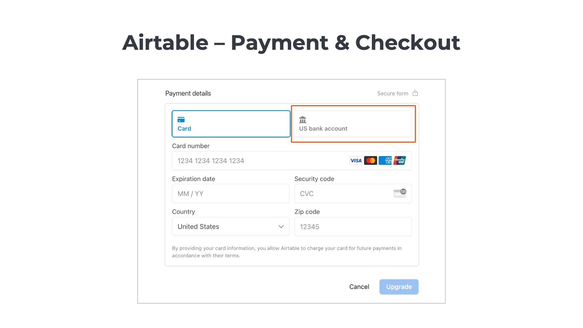
If the customer chooses the bank account option, they are prompted to supply additional information such as their email address, first and last name, and billing zip code. They are also asked to identify the name of their bank. A few of the larger US banks are listed on the payment details form to allow for easy access. There is a search bar that enables users to find all of the other financial institutions.
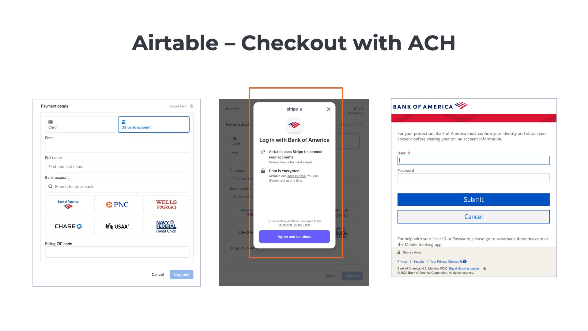
Once a bank is selected, the customer can connect directly to Airtable to make the payments. The user is prompted to log in to their bank account (e.g., Bank of America) and authorize the direct debit ACH transactions. The advantage of providing this real-time connection to the bank is that the recurring billing process is set up before the checkout is completed.
Figma PLG Self-Service Checkout
Upsell and Cross-Sell Campaigns
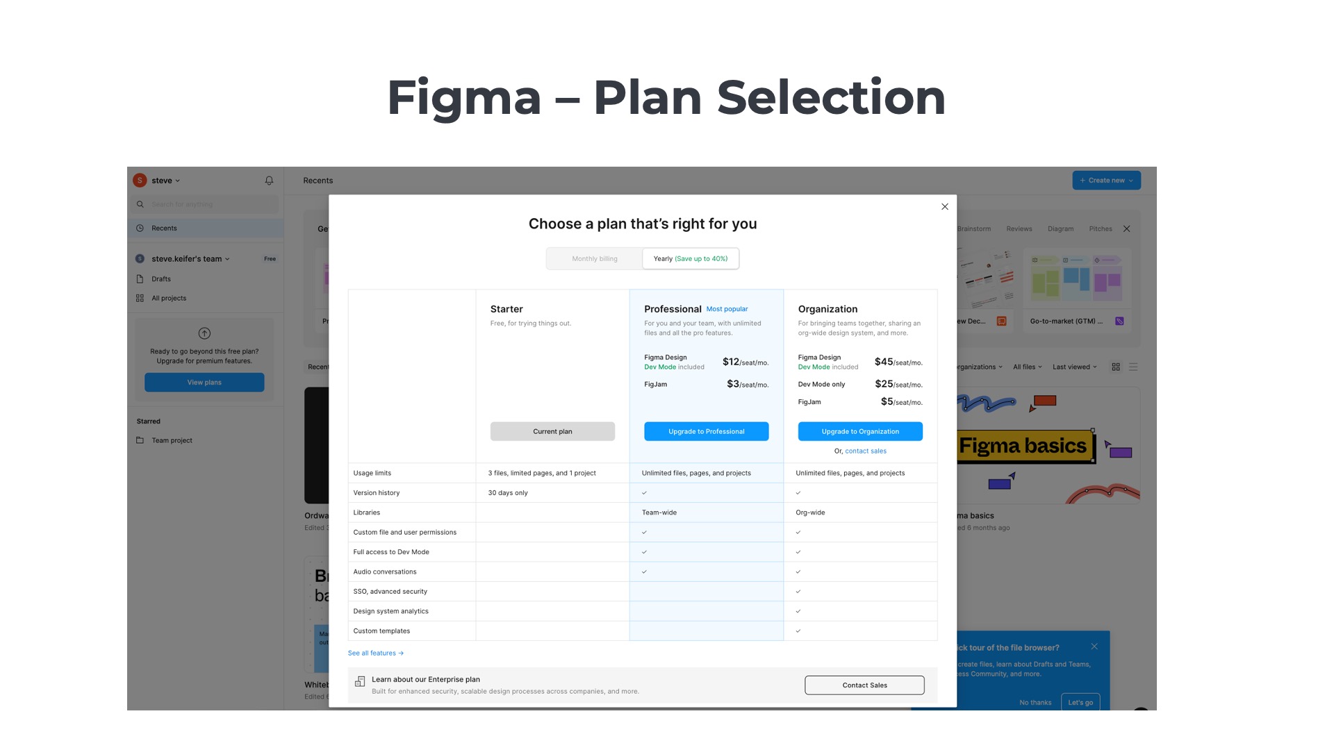
At a high level, Figma’s self-service checkout process is similar to other SaaS providers. Customers 1) select a plan, 2) choose a subscription length, and 3) enter a payment method. However, there is one big difference—Figma’s checkout process is designed for upselling and cross-selling!
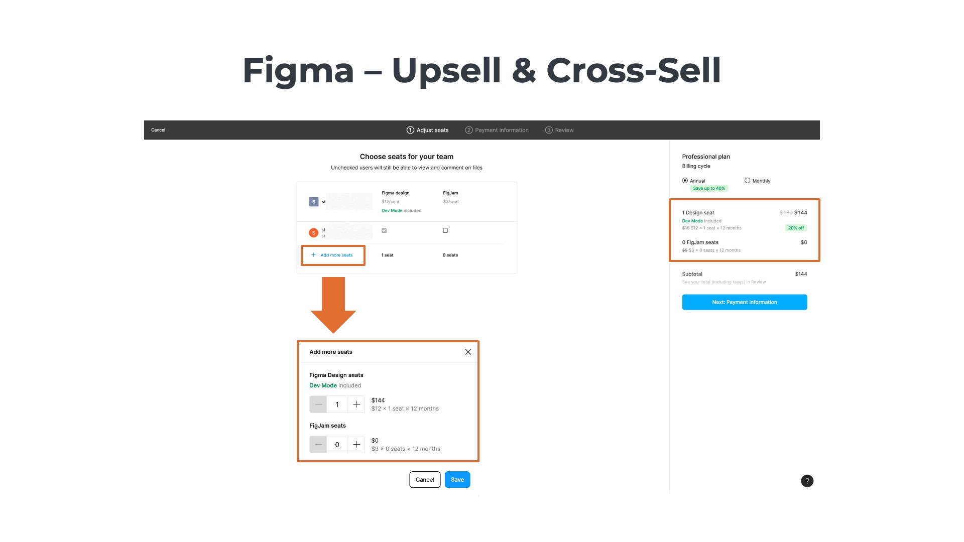
After the customer selects a plan, they are taken to another screen that shows an editable shopping cart. Users who want a fast checkout can simply review the cart and click through to the payment section. Alternatively, they can modify their cart by 1) adding more seats for their original product, Figma Design, or 2) adding a second product, FigJam, to the cart. Ideally, they would choose option #3 to do both.

The third and final step is the checkout. The unit quantities and items are no longer editable in the cart, but the customer can make a last-minute decision to upgrade from the monthly to an annual plan.
Zapier Freemium Upgrade
Upsell and Cross-Sell Campaigns
Like Figma, Zapier also integrates upsell and cross-sell opportunities within the self-service checkout flow. The process starts with Zapier’s plan selection page that also displays a shopping cart on the right side. The user selects one of the three core plans for Zapier’s automation platform, and the cart is updated dynamically. Zapier’s shopping cart isn’t the typical order summary cart most SaaS providers use. Instead, it lists the core product along with the freemium versions of all the available add-ons by default.

The next step is a dedicated screen focused on upsell/cross-sell. Each of the add-ons is listed on the left side of the page. By default, the customer is given the freemium version of each add-on, which includes a limited usage threshold. However, the customer can select higher-tier packages such as “Pro” and “Advanced” to expand the usage allowances. Again, the shopping cart on the right side of the screen is presented with each add-on package included by default.

The third and final step is the checkout. The final cart only presents the billable products and excludes the freemium offerings. At the bottom of the cart, there is a drop-down menu that explains the usage allowances included in the selected plans.

On the left side of the checkout page, Zapier allows customers to enter a tax identification number, which is needed for invoices in many countries with VAT, GST, or HST programs. Zapier also allows new customers to add secondary billing contacts in the IT or procurement organizations. The fields are optional, but even if Zapier collects data from 20% of users it will be useful to the accounts receivable team.
Canva Pre-Trial Checkout
Opt-Out Free Trial Model
Canva is an interesting case study, as the customer completes the checkout process before accessing the free trial. This is an example of an opt-out free trial model. The customer provides a payment method at the beginning of the trial but is not charged until the trial ends. The user can cancel their subscription at any time before the end of the trial to avoid making a payment. However, if the customer does not act, they will automatically be enrolled in the paid plan on the trial expiration date.

Each of the examples we reviewed earlier had opt-in free trials. With Asana, Monday.com, Airbase, Figma, and Zapier, the user gains access to the free trial (or freemium plan) without having to supply a payment method. The checkout process only occurs if the customer clicks on the call to action to “upgrade” from their free plan to a paid plan.

Let’s review the Canva self-service checkout process in greater detail. The first step is plan selection. On Canva’s pricing page, the customer can select the freemium plan or start a free trial of one paid plan for fourteen days. When the user clicks on the free trial button, a pop-up appears that prompts the user to select the billing frequency and subscription length. Also noteworthy is the billing schedule presented to the right of the cart.

The third and final step is to capture the payment details. Remember that the user is not making the initial payment in this checkout flow. Instead, the customer is registering for the free trial. Canva uses a number of strategies to ensure the user understands the distinction between the trial timeline and the billing schedule. On the right, the timeline is displayed with the 1) free trial start date, 2) reminder date, and 3) initial payment date is presented on the right of the page. On the left side, the amounts with dates due are listed. Also, note that the call to action button says “Get your free trial” versus “Pay Now” or another term that implies an immediate charge.
Hootsuite Self-Service Checkout
Skip the Trial and Upsell Campaigns
Like Canva, Hootsuite offers an opt-out free trial model. Customers must provide a payment method and complete checkout before accessing the free trial. Similar to Figma and Zapier, Hootsuite integrates an upsell campaign into the checkout process.
New customers selecting the free trial button are redirected to Hootsuite’s pricing page. There are three plans, two of which offer a trial. One of the most interesting elements of Hootsuite’s strategy is the incentive it offers customers to skip the free trial and start directly with a paid plan. On the pricing page, notice that the primary call to action is to skip the trial and get 20% off.

Customers who advance in the 30-day free trial are taken to an account creation page, where they are requested to provide their name and business email and select a password. Social sign-in options are offered to lower friction and enable customers to log in with Facebook, LinkedIn, X, or Google.

The next step is the payment and checkout page. At the top, Hootsuite offers an upsell promotion: the unlimited social accounts add-on (light blue arrow). For each upsell conversion, Hootsuite increases its ARPU by 60% from $250 to $400 per moth. On the upper right (red arrow), the customer can choose between an annual or monthly plan. Hootsuite offers a 40% discount for committing to the annual plan.

One of the keys to success with an opt-out plan is clearly explaining the payment schedule to customers. Hootsuite clarifies in three separate locations on the checkout page that there are no charges during the 30-day free trial. In the green arrow at the bottom, the order summary explains what is due now and what is due in 30 days. On the right center (orange arrow), the summary plan description highlights that the 30-day free trial is 100% free, and customers can cancel anytime. There is also a FAQ on the bottom right that provides more detailed answers to the questions 1) “Will I see this charge right away?” and 2) “Can I change or cancel my plan?” Also, note that the call to action is not “Pay Now” or “Submit,” but instead “Start My Free Trial” which reinforces the message that a payment is not due immediately.
Clay Freemium-to-Paid Upgrade
Store Payment Credentials
Customers can select from one of Clay’s five different plans. There are a few interesting things to note about Clay’s pricing page. First, the highest is an enterprise plan but is placed in a different place on the page than expected. While most SaaS companies list the enterprise plan on the far right of the pricing table, Clay lists its enterprise offering at the bottom of the table. The pricing defaults to monthly, but users can toggle to the annual plan for a 10% discount.

Clay’s plan tiers are usage-centric, primarily differentiated by the number of credits that are included. There is a built-in upgrade campaign on the pricing page that allows customers to select additional credits for each of the plans.

Clay’s checkout page is a simple, but elegant design. The shopping cart on the left is minimalist with just the plan, subtotal, and total. One the right side, the customer enters their credit card details, cardholder name, and billing address. Note, that Clear offers the option for customers to store their card details for future online transactions with the Link digital wallet (powered by Stripe).

Also, noteworthy is that customers who enter their business address on the right side get a real-time update of the taxes due. Clay is one of the few SaaS companies that offers the option to view tax amounts before checkout. Most others do not provide a preview.
Typeform – Freemium Conversion
Digital Wallet and Upsell Campaign
Freemium users are first prompted to select one of Typeform’s five different plans. The plan selection page has a few interesting things to note. The default choice is the annual plan, and the second highest tier – the business plan. Business includes key features such as Salesforce integration, conversion tracking, and drop-off analysis. The tiers are not only differentiated by features but also by the number of users and the usage allowance. There is a soft upsell campaign at the bottom of the plan selection page that enables users to increase the allotted monthly response limit for their plan.

The billing page is simple and clean but with a few interesting differentiators. First, customers can enter a coupon code on the right side underneath the shopping cart. The discount is automatically applied to the total for valid coupons.

Second, Typeform allows customers to pay with a digital wallet – Google Pay. Customers choosing to pay with Google don’t have to enter their credit card details into the checkout form, which reduces time and effort.
Conclusion
Optimizing your self-service checkout is paramount for product-led growth, directly influencing new customer acquisition and overall revenue. The most effective checkout experiences skillfully navigate the differing priorities of customers seeking ease and flexibility, and providers aiming to maximize bookings and gather crucial data. By carefully designing the user experience and strategically selecting data points, companies can create a frictionless path to conversion that drives sustained growth and customer satisfaction.
Frequently asked questions
What is a PLG self-service checkout?
A streamlined flow where users can select a plan, enter details, and pay without sales involvement—optimized for fast activation and time-to-value.
What makes a great PLG checkout page?
Clear pricing/tiers, minimal fields, strong value props, social proof, transparent taxes/fees, trust signals, and frictionless payment options (card, ACH, wallets).
How should pricing be displayed on self-service pages?
Simple tiers with highlighted “recommended” plan, monthly/annual toggle, usage limits spelled out, and transparent overage or add-on pricing.
Which UX patterns improve conversion?
Progress indicators, guest/SSO options, auto-apply coupons, inline validation, localized currency, and real-time tax calculation to prevent surprises.
How can SaaS reduce drop-offs in checkout?
Remove unnecessary fields, support saved payment methods, offer trials or money-back guarantees, and enable dunning/retries for failed payments.
You May Also Like
 Digital Wallet Payments: How They Work and Why They Matter
Digital Wallet Payments: How They Work and Why They Matter
 Payfac Explained: How Payment Facilitation Works and Who It Is For
Payfac Explained: How Payment Facilitation Works and Who It Is For
 Understanding Level 3 Credit Card Data for B2B Payments