TL;DR: Usage-Based Pricing Presentation Formats
Choosing the right presentation format for usage-based pricing is essential for reducing customer confusion and accelerating sales cycles. SaaS and cloud companies must balance the flexibility of their pricing models with clear, scannable layouts that help customers understand how their costs are calculated.
Key Takeaways
-
The Model: Presentation formats like grids, tables, and sliding scales are used to display various value metrics and discounting models.
-
Ideal Context: Most common in cloud infrastructure and SaaS companies where pricing depends on consumption, multiple product configurations, or geographic regions.
-
The Lifecycle:
-
Selection: Choose a format (e.g., Grid) based on product volume and configuration complexity.
-
Display: Present price per unit alongside value metrics and features.
-
Calculation: Use Metered Billing Software to automate the transition from usage data to accurate customer invoices.
-
-
Impact: A well-designed format provides transparency, prevents “bill shock,” and allows for complex SaaS Billing structures without overwhelming the buyer.
Implementation Steps
-
Identify the Metrics: Determine if the price is based on a single value metric or multiple variables (e.g., hours vs. transactions).
-
Match Format to Complexity: Use a simple List for high-volume, single-metric products, or a Table for multi-dimensional pricing.
-
Apply Discount Models: For volume or tiered discounts, implement a Sliding Scale to offer immediate price transparency.
-
Automate Data Entry: Use Subscription Invoicing Software to ensure the customer’s actual usage flows seamlessly into the selected pricing format.
The Bottom Line
Pricing presentation is the bridge between complex usage data and the customer’s decision to buy. By mastering formats like columnar tiers or hybrid tables, businesses can maintain SaaS Accounting accuracy while providing a user-friendly experience that clearly communicates value.
Are you looking to automate the tracking of these usage metrics within your billing system, or are you currently calculating these consumption tiers manually?
The Presentation of Usage-Based Pricing
Simplifying Pricing and Discount Models
The power of usage-based pricing comes from the creativity and flexibility it offers. By making creative use of different value metrics, discounting models, and contract structures, SaaS and cloud companies can generate an almost infinite number of pricing permutations.
However, the power and flexibility offered comes at the expense of complexity. Usage-based pricing can be very confusing to customers. A pricing model that is challenging to understand will delay sales cycles and put deals at risk. That is why the most successful SaaS and cloud providers invest time and energy experimenting with different ways of presentation formats for their offerings until they find the most customer-friendly approach.
Five Common Presentation Formats
There is no limit to the number of different presentation formats for pricing. However, the SaaS and cloud industry has converged on five common approaches for usage-based pricing:

These presentation formats can be used to display pricing or discounting models.
Also, note that the core five presentation formats can also be combined to support more complex pricing arrangements. We refer to these combinations as hybrid presentation formats.
Grid Presentation
Best for small number of products with single configuration
The grid presentation format is popular for companies that have lots of different offerings that need to be displayed concisely on a single page. Each section of the grid features a single offering with limited details such as the name of the product, a short description, the price per unit and the associated value metric. There is usually a hyperlink that offers customers an option to learn more about the features and capabilities of the product.

The grid format works best when you have:
- Fewer than 10 products that can be displayed on a single screen
- Each product is offered in a single configuration/package
- Minimal detail about the product description needs to be displayed
- Pricing, for each product, is based upon a single value metric
Real World Example
Below is a grid presentation format for various data management services such as machine learning and a data warehouse. Within the grid there are seven different products listed. For each product the price per unit is defined along with a short description and a link to more information.

For additional details on the example pricing model shown above visit the Cloudera website.
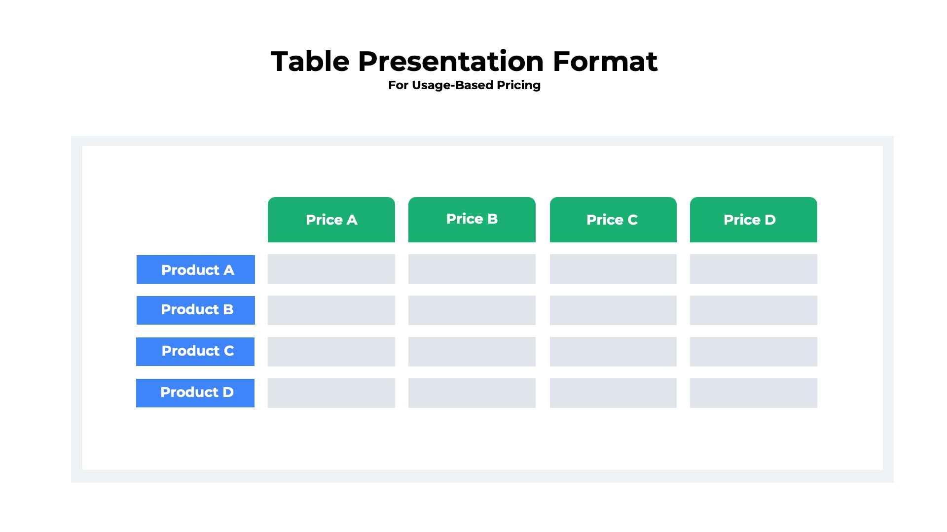
Table Presentation
Best for multiple products with multiple price points
The tabular format offers great flexibility to present price schedules that have multiple dimensions. In the table format, the individual products are listed on the left of the horizontal rows. The column headings represent the different dimensions for pricing.
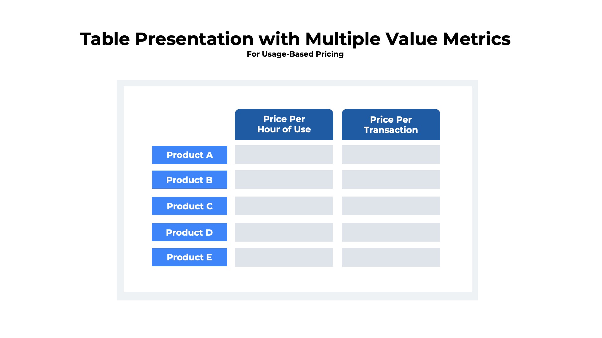
Multiple Value Metrics
Tables can be used for pricing based upon a single value metric resulting in a simple price x quantity (value metric) equation. Alternatively, the tables can be more complex with pricing being a multi-part equation based upon multiple, different value metrics.
For example, below is an example of a table presentation format that shows how pricing for a list of products varies based upon two different value metrics 1) the hours that the service was used and 2) the number of transactions processed. The monthly charges will be determined by multiplying price x quantity for each column and summing up the total.
For example, suppose the customer used
Product A
10 hours at a price of $10 per hour
1000 transactions at a price of $0.10 per transaction.
The pricing would be calculated with two equations:
10 hrs x $10/hr = $100
1,000 transactions x $0.10 = $100
Total = $100 + $100
Total = $200
Real World Example
Below is an example of a table presentation format with two different value metrics for pricing of cloud integration. The first value metric is the number of tasks per hour. The second is the data transfer measured in GB.
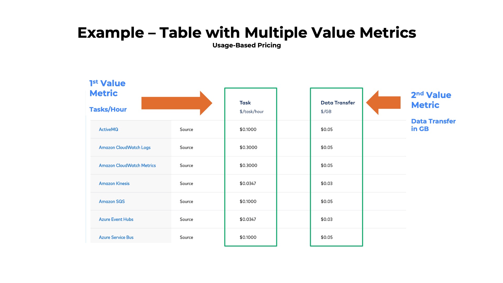
For additional details about the example table presentation format shown above visit the Confluent website.
Multiple Use Cases
Tables can also be used to present pricing with a single value metric that varies based upon the use case. In this example, assume we have an automated SMS messaging service that is priced per message. However, the price per message varies based upon whether the use case is
- Send with text only
- Receive with text only
- Send text with picture
- Receive text with picture
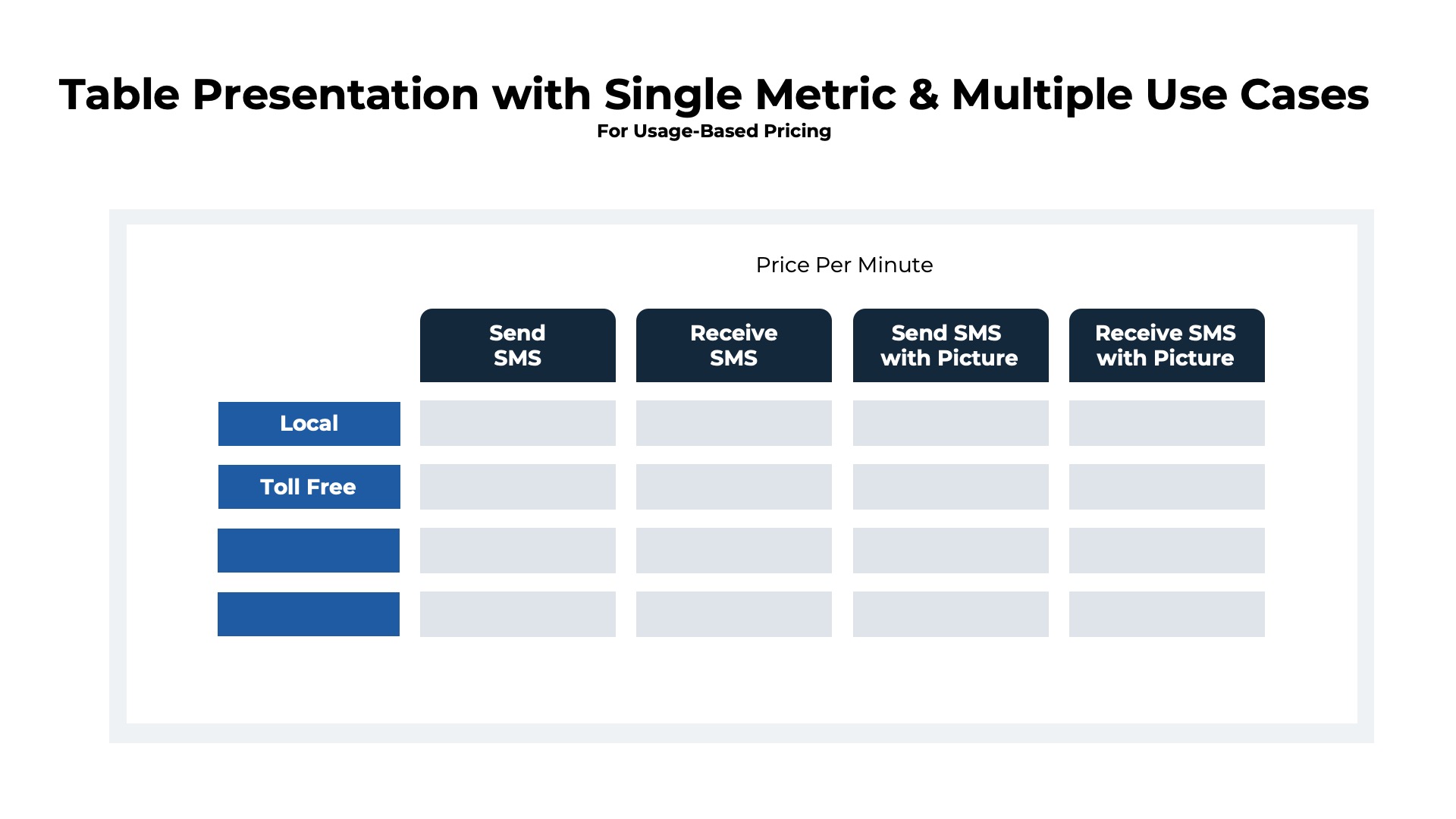
For example, suppose that a customer sent 25,000 messages from each category. The total monthly charges might be:
25,000 text only received x $0.01 per text = $250
25,000 text only sent x $0.02 per text = $500
25,000 text with image received x $0.05 per text = $1,250
25,000 text with image sent x $0.10 per text = $2,500
Total = $250 + $500 + $1,250 + $2,500
Total = $4,500
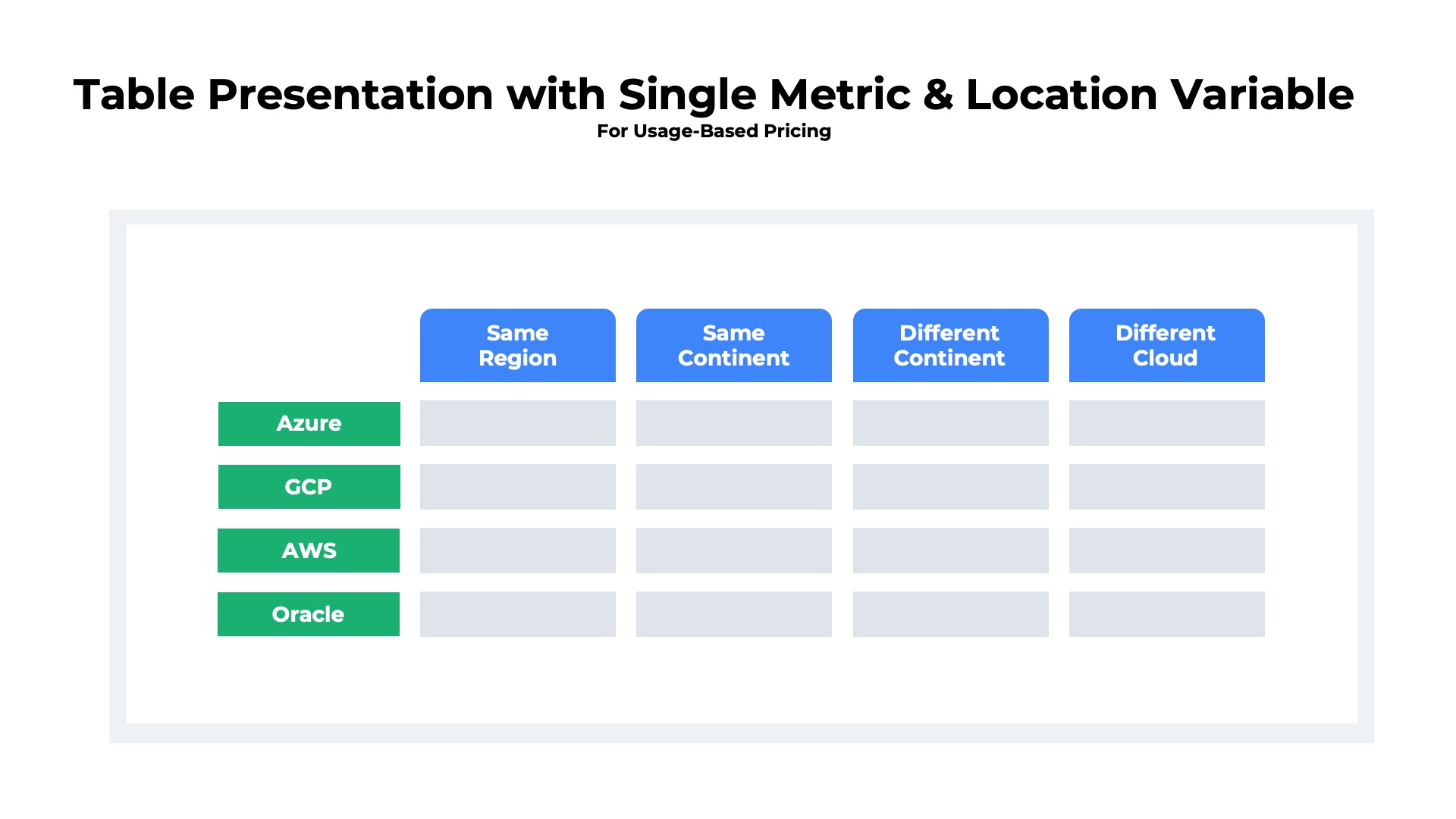
Multiple Locations
Below is another example of a table presentation of a list of products which are each priced based upon a single value metric. In this case, the price varies based upon which geographic region the usage is consumed in, perhaps due to differing cost structures by location.
Multiple Volume Tiers
Tables are also an effective approach for presenting a tiered discounting model. Below is a table that illustrates how the per unit pricing varies as the customer’s volume of consumption increases. In this example, the product is high volume data transfer in and out of a cloud data center. There is a single value metric (GB of data transferred), but the per unit charge decreases with volume.
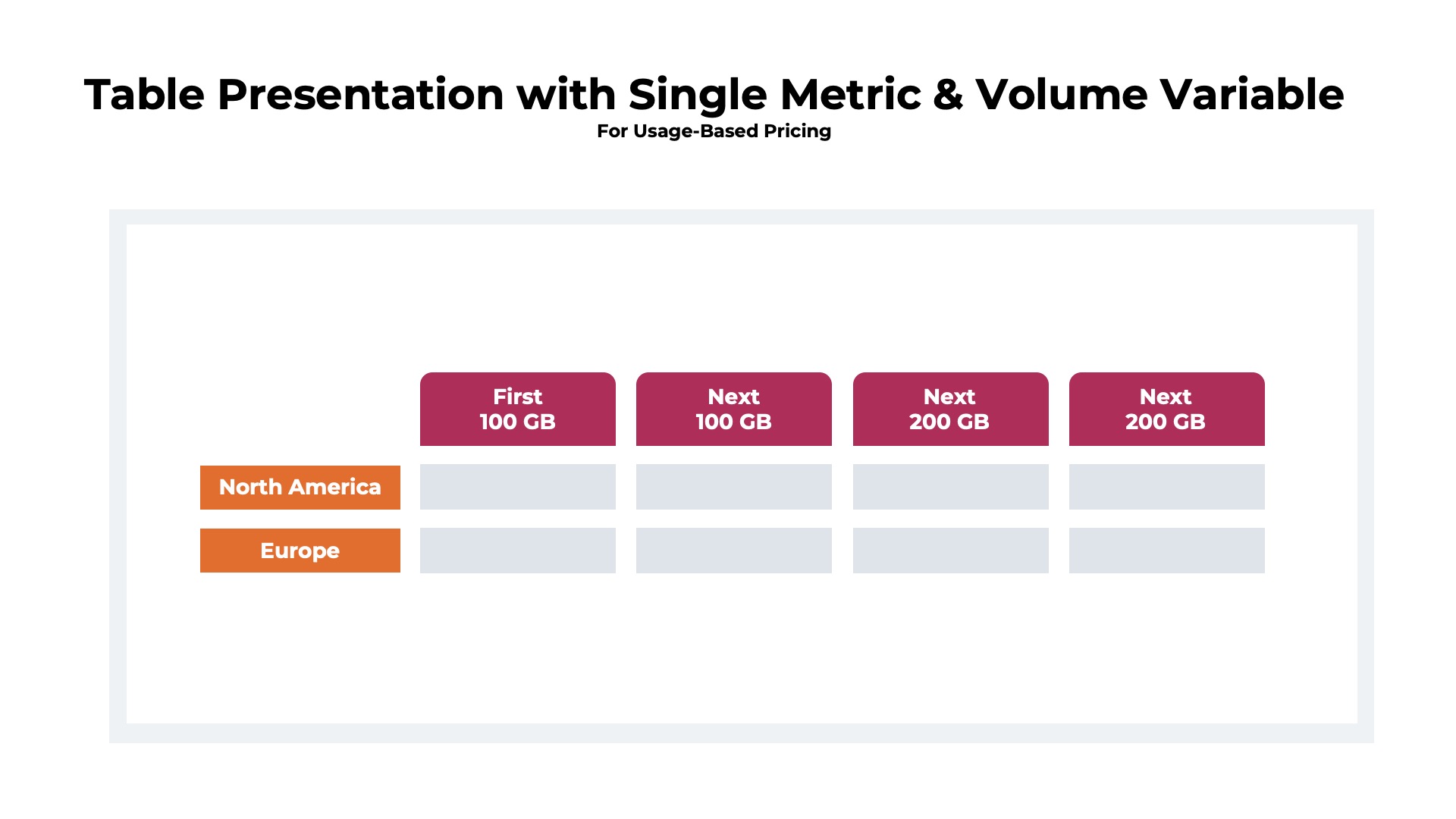
For example, suppose that a customer transferred 250GB in a single month to/from the North America data center. The total monthly charges might be:
First 100 GB @ $10/GB = $1,000
Next 100 GB @ $9/GB = $900
Next 50 GB @$8/GB = $400
Total = $1,000 + $900 + $400
Total = $2,300
Real World Example – Hybrid Location and Volume Tiers
Below is a real world example of a tiered discounting model for data transfer services that also varies by location. Each of the columns represents a pricing tier. Each of the rows represents a different location.

For additional details on the hybrid volume and location presentation format shown above visit the Google Cloud Platform Content Distribution Network page.
List Presentation
Best for high number of products with single configuration and pricing
The easiest approach to price presentation is the list format. The products simply are listed in a row and column format. At a minimum the list will need two columns for 1) product name and 2) unit price. The two column format is common when there is a list of add-ons that can be purchased in combination with a base product.
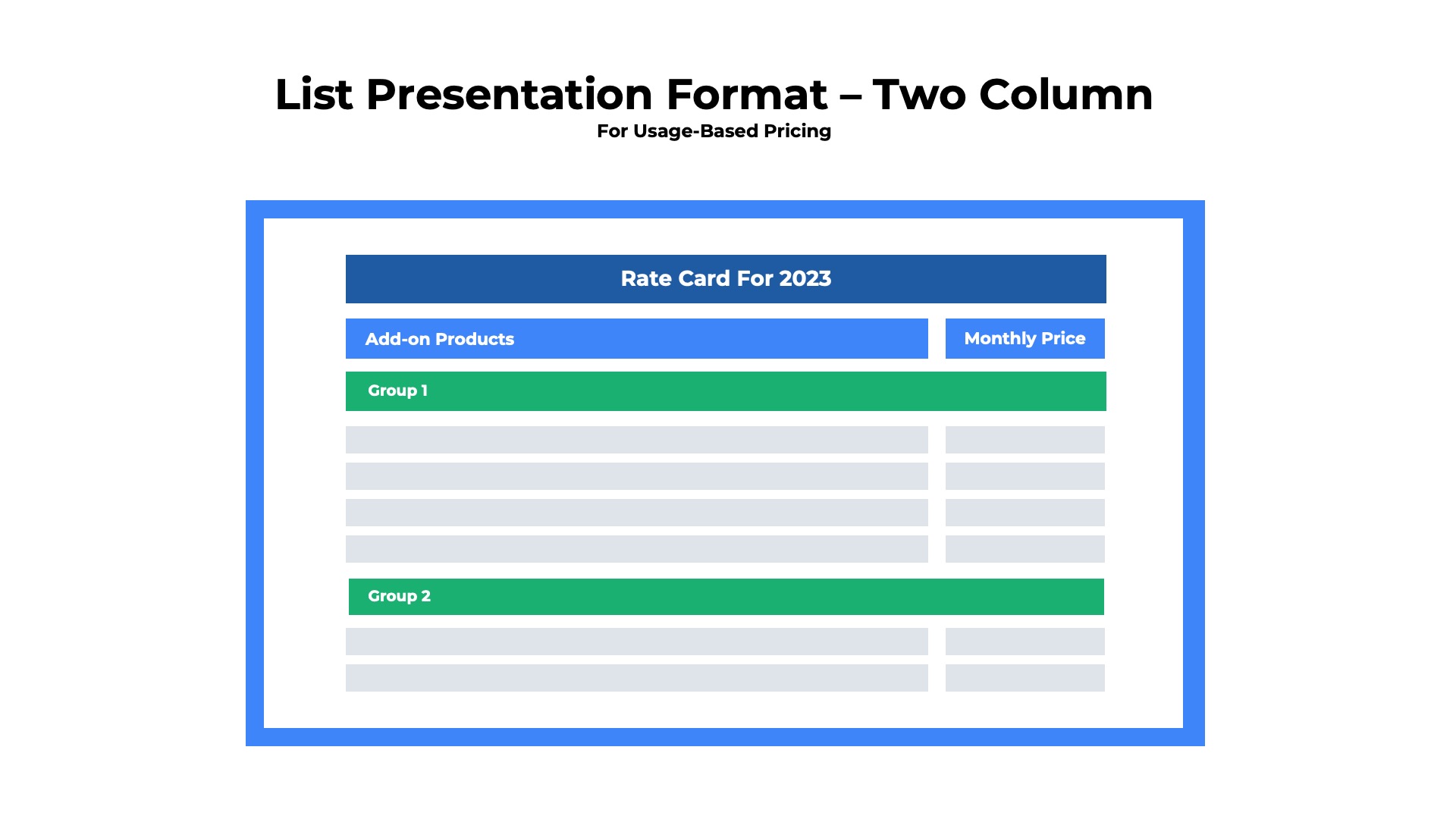
Lists are not limited to two column formats. Lists with five or more columns are common with cloud infrastructure providers. Compute, database, storage, and machine learning offerings are commonly presented in list format with the CPU, memory, storage, and cloud platforms each as columns in addition to the price.
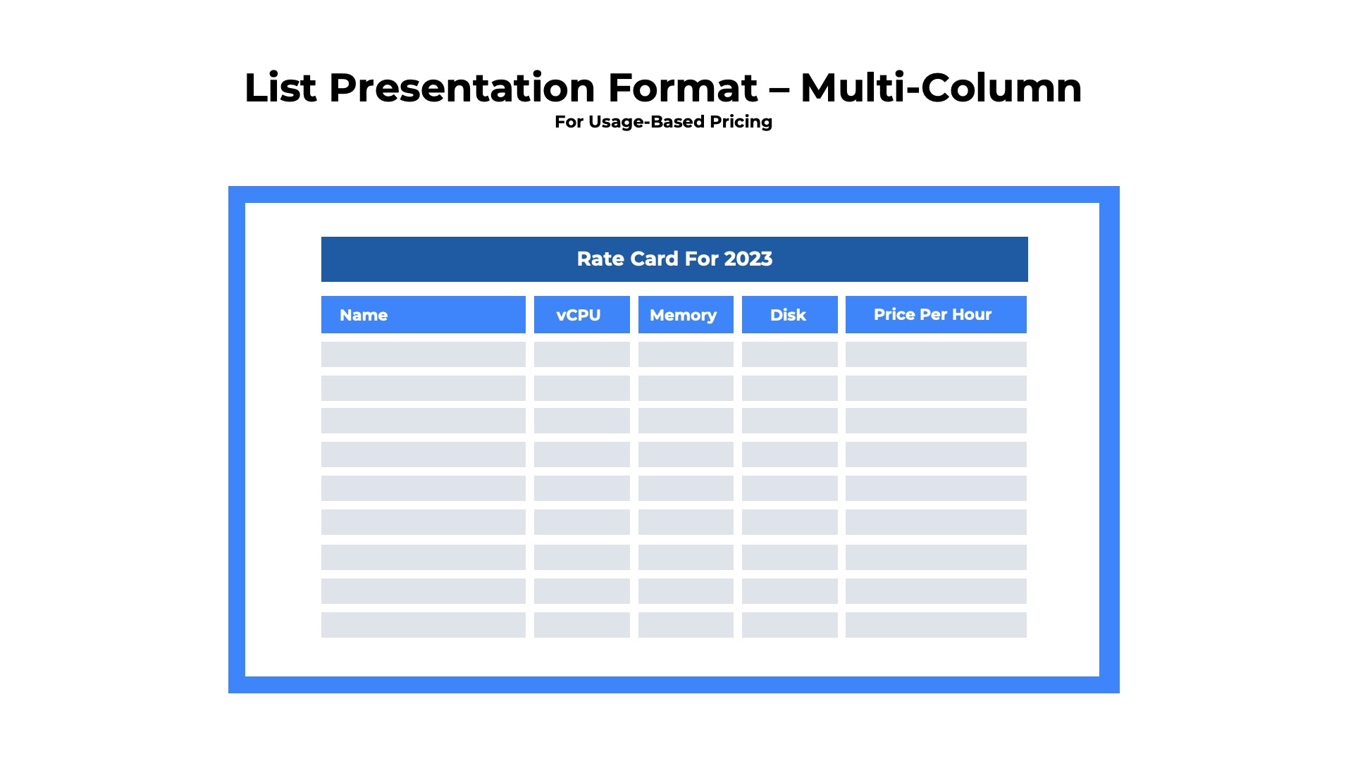
The list presentation format and table presentation format (described above) can look very similar, especially when the list has multiple columns of detail for each row. We distinguish the two by the number of columns that are presenting pricing. A list has only one column with pricing and a table has two or more columns with pricing variables.
The list format works best when you have:
- Either a short or long list of products to present
- Product names are self-explanatory not requiring a detailed word description
- Pricing is based upon a single metric
Real World Example
Below is an example of the list presentation format for a cloud-based rendering service that generates complex 3D images and interactive experiences for virtual reality devices. There are three products listed along with the usage-based price and a brief description.

For additional details on the example list presentation format pricing shown above visit the Azure Remote Rendering product page.
Column Presentation
Best for pre-configured, multi-tiered packages
The column presentation format is one of the most popular models for SaaS and cloud products. Column presentation is typically implemented with a packaging strategy in which the offerings are configured into three (or more) different bundles of features and entitlements with a fixed price point. Column format is appealing because customers can quickly compare a handful of pre-configured packages at different price points to decide which one is best for them.
At the top of each column the package name is displayed along with a price and the associated value metric. Below the column headings, a detailed list of features and entitlements is displayed that allow customers to compare the functionality offered within each tier. Below is an example of a multi-tiered columnar presentation format for three configurations that are packaged based upon the feature set (good, better, best).
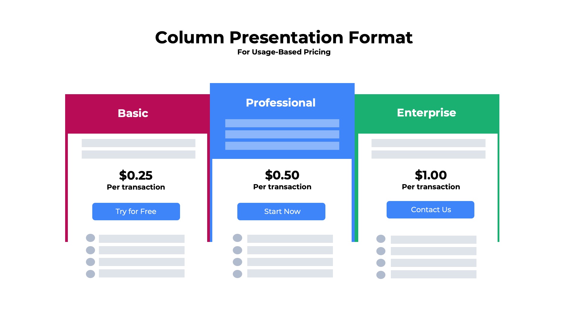
In many cases, a summary of the features is presented directly below the column headers within the visible screen area. The summary view that makes it easy for the customer to quickly differentiate between the packages without having to scroll down through a long list of features.
For example, suppose there was a three tiered “good, better, best” package for employee background screening that was priced based upon the number of people verified.
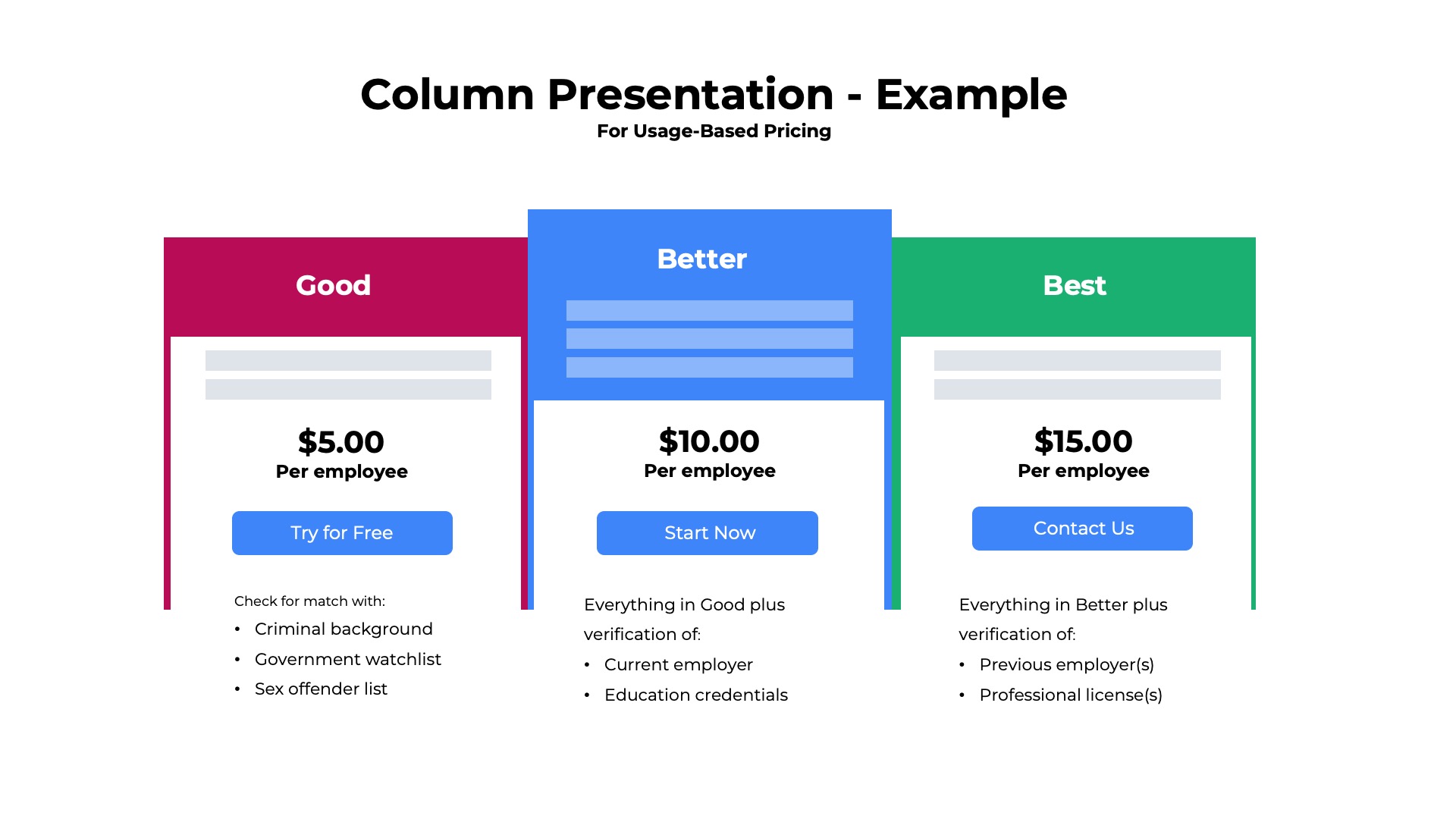
The good package summary description might be
Check for match with persons on:
- Criminal background
- Government watchlist
The better package summary description might be
Everything in good plus
Verification of employees:
- Current employer
- Education credentials
The best package summary might be
Everything in better plus
Verification of employees:
- Previous employer
- Professional licenses
- Financial history
Below is another example of a multi-tiered columnar presentation format for four configurations that are packaged based upon the usage-allowance. Note that there are feature differences between the packages as well, but the usage allowance is the primary metric used to distinguish the packages.

The column tier approach works when the
- Single product to be represented on the pricing page
- Product is bundled into 2-5 different configurations,
- Comparisons of the features and entitlements offered with each package need to be displayed
- Pricing is based upon a single value metric
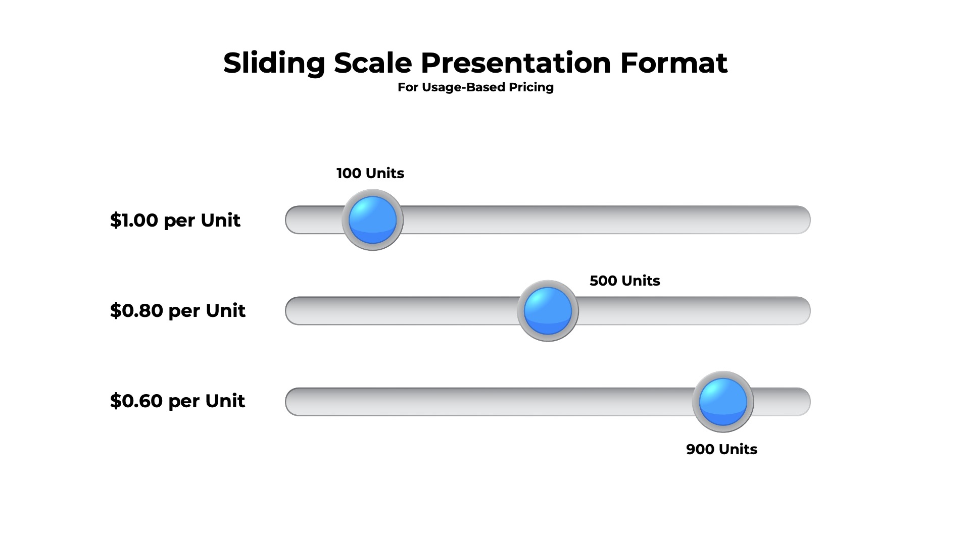
Sliding Scale
Best for volume discount pricing
The sliding scale is typically used to illustrate how volume or tiered discounting models work. The customer can adjust the amount of product they expect to consume and immediately see what the price will be at that usage level. The sliding scale improves the customer experience by providing transparency on pricing. It also frees the customer from having to master complex rating calculations when they are in the early stages of the buying process.
The sliding scale works best when you have:
- Single product to be represented on the pricing page
- The product is offered in a single configuration
- Pricing can be based upon one or more value metrics
- Volume or tiered discounting model
- Standardized across all customers (versus being negotiated for each contract)
- Automatically applied (versus being applied only for customers on long-term contracts)
Real World Example
Below is an example of a sliding scale presentation format for a cloud-based map service. Customers can slide the bars left and right to see the pricing for various combinations of mapping requests sent via API.

For additional details about the example presented above consult the Google Maps pricing page.
Read More of the Usage-Based Pricing Guide
Additional topics in the guide include:
Overview
Pricing Metrics
Discounting Models
Contract Structures
Packaging Strategies
Presentation Formats
Calculating Quantity
Usage-Based Billing
More Articles, Webinars, and Resources
About Usage-Based Pricing

How 10 Cloud Providers with Usage-Based Pricing Report ARR
How do companies with usage-based pricing report on ARR? We compiled ARR definitions from the investor filings of 10 large public companies.